html页面输入框input的美化
input输入框是网页必不可少的组件,可是每个浏览器对于输入框的显示样式各有不同
例如:
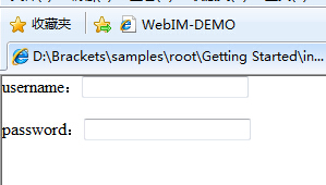
上图分别就是谷歌浏览器和IE浏览器自带显示的输入框,样式也不足人意,所以大多都会自己写样式
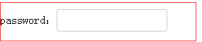
以下是一个简单的文本框样式
input{ border: 1px solid #ccc; padding: 7px 0px; border-radius: 3px; /*css3属性IE不支持*/ padding-left:5px; }
效果图:
样式属性含义:
border: 1px solid #ccc; /*设置输入框边框,边缘线的颜色、大小、及实线虚线*/ padding: 7px 0px; /*设置输入框高度,也可以用height,但是用height的话,输入框的光标会置于顶部,还要设置其他样式去固定,而且还不一定会兼容很好*/ border-radius: 3px; /*这个属性石css3里面的,IE不支持*/ padding-left:5px; /*让广告距离左边5个像素,一开始光标是贴着左边输入框的边缘的*/
基本上以上的样式算是如今比较常用的了
然后就是input的一些其他的设置
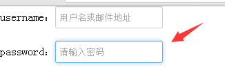
比如:属性 placeholder
这个属性在输入框里有提示文字效果,CSS3属性,不支持IE

input点击发光特效:
input{ border: 1px solid #ccc; padding: 7px 0px; border-radius: 3px; padding-left:5px; -webkit-box-shadow: inset 0 1px 1px rgba(0,0,0,.075); box-shadow: inset 0 1px 1px rgba(0,0,0,.075); -webkit-transition: border-color ease-in-out .15s,-webkit-box-shadow ease-in-out .15s; -o-transition: border-color ease-in-out .15s,box-shadow ease-in-out .15s; transition: border-color ease-in-out .15s,box-shadow ease-in-out .15s } input:focus{ border-color: #66afe9; outline: 0; -webkit-box-shadow: inset 0 1px 1px rgba(0,0,0,.075),0 0 8px rgba(102,175,233,.6); box-shadow: inset 0 1px 1px rgba(0,0,0,.075),0 0 8px rgba(102,175,233,.6) }
效果图: